Genre Research - Pop Punk Music Videos
From further research into the pop punk subculture, it is apparent that the fairly recent genre holds many distinctive conventions that sets it apart from other types of music and allows for the representation of multiple themes associated with it such as youth, rebellion and energy. One way in which these are often represented is through mise-en-scene, with costume in particular being especially recognisable.
Below is a prezi outlining conventions of particular areas of Pop Punk and music videos of the genre:
Below is a presentation outlining conventions of settings and props in pop punk musuc videos:
Below is a presentation outlining conventions of costume and makeup in the pop punk genre:
Below is a prezi outlining conventions of particular areas of Pop Punk and music videos of the genre:
Below is a presentation outlining conventions of settings and props in pop punk musuc videos:
Below is a presentation outlining conventions of costume and makeup in the pop punk genre:
Conventions of pop punk costume research from hopewetherall
Detailed analysis of a similar media product – “Some Kids Just Can’t Hang” music video by Major League.
The film paired with “Some Kids Just Can’t
Hang” by Major League is an excellent example of a creative yet conventional
pop punk music video. One very effective way in which the band Major League is
represented as being a conventional pop punk band is through effective use of post-production
editing. The most noticeable aspect of this editing is, arguably, the fast pace
of it; this connotes a number of themes. The theme of chaos is attended to
throughout the music video, which is enhanced by how short the shots used are.
This is because it is in line with the pace that events within the narrative
follow each other and also because it matches the upbeat sound of the music
being played. It is rare that the pace of editing and length of shots of music videos of any genre do not match the sound of the music played; this is because if it did not, the piece would be uncomfortable to watch and would not truly represent the impression and feel that the artists wish for their work to emit. The liveliness of the music and editing that matches it also represents the youthfulness of the band, of which is comprised of young men in their early-mid twenties; this is a true representation of the high energy of young adults of their age and in fact of the demographics of their target audience.
Jump cuts are used throughout the video at sporadic points, especially during shots of the performance given; this disjointed movement gives the impression of disorder, increasing the feeling of excitement brought by the video that is parallel to the band's busy lifestyle of touring and partying. As well as jump cuts, inserts of what appears to be a broken television screen towards the end of the video and an image of the band's logo are flashed briefly across the screen at random intervals; these are unexpected and allow the band to further promote their brand identity with their logo as well as add to the theme of chaos present within the lyrics of the song and a multitude of aspects within its video. The broken television screen holds suggestions of destructiveness that represent the band as being rebellious and carefree, which are conventional characteristics of pop punk band members and their anarchic ideals.
Also added during the post production process are short bursts of coloured light over the screen that holds a similar appearance to that of strobe lighting; this again adds to the chaos of the scenes of performance and adds to the vibrancy and fun of the video's aesthetics because the colours of lighting are bright shades that could be described as "childish", such as the primary colours of red, yellow and blue. In contrast to this, however, low key lighting is used predominantly during shots of Major League's performance. It represents the underlying theme of frustration of the attitudes of "friends" that the song's lyrics portray. This is demonstrated by lines from the chorus of "So this is what best friends do, they cut the ties and live the lives of everyone around you everyone around you." Friendships is regularly sung about by pop punk vocalists because it holds significance within the majority of young adult's lives; their lifestyles are heavily influenced by friends because the peers are together constantly on tour and spend much of their time participating in activities such as skateboarding and playing music together that carry with them a social scene.
This theme is combined heavily with that of struggles and anger in "Some kids just can't hang" and is portrayed through the anger of the vocalist's voice and the aggression heard in the sounds of the instruments. The frustration signified by low key lighting differs entirely from that of the shots of a children's party at the beginning of the video, which show childlike happiness; the lighting accompanying the narrative focusing on the child, however, shifts dramatically in spectrum when day turns to night, for it gets darker as the young boy appears to face more and more bullying from his peers. Red lighting is used in a scene where the child wakes up inside a tent with his bullies standing over him. This shows clearly his struggles by connoting fear.
because the colour is associated with danger shown within nature in things like poisonous animals and blood. Succeeding this are shots using noticeably dark colours and low key lighting to show the danger of the situation that is represented by other aspects such as props. The bullies in the narrative are shown to be holding baseball bats in a threatening stance; this further relates to the message of the lyrics that people cannot be trusted and to the narrative that demonstrates this. The weapon remains as childlike as the young boy holding it because rather than a more adult object designed for the purpose to cause physical damage, such as a gun, the bat is intended for use in sports and was probably owned by the boy for this purpose.
The fear felt by the child being bullied and the threat of these boys is also demonstrated through the use of camerawork; this is shown throughout the video, but is more noticeable towards the end when the tension of the situation climaxes. An example of this is the high angle close up used to show the victim's distressed facial expressions when he wakes up to find his bullies standing above him holding weapons. The close up allows the viewer to read the child's frightened body language whilst the high angle of the shot causes him to appear weak, with the vulnerable position of laying on his back supporting this; this contrasts with the low angle mid shot showing the bullies. This shot makes the weapons obvious to see and also makes the boys holding them seem more powerful within the situation because they look larger and more in control. It is conventional within the majority of music genres for narratives of music videos to relate to the lyrics of the song so that it makes sense and its message is portrayed in an appropriate way; if the narrative was entirely unrelated, confusion may arise and some purpose would be detracted from the piece. An interesting, relevant narrative is effective in music videos because it keeps the audience watching; this is especially true of the plot in the video for "Some kids just can't hang" for there are tense moments that hold attention.
Another area of mise en scene that was considered in the planning of the music video for "Some kids just can't hang"is the setting in which the shots were taken. Major League are shown to be performing in an everyday home setting, acknowledging their humble roots; most bands of the genre start their careers simply by practicing in their garage with their friends and playing local shows organised by the young alternative community themselves. Bands of the genre are not often manufactured by established record labels, for this would contradict the very message of individuality that pop punk music promotes. For this reason, many bands are signed to independent record labels such as No Sleep Records, of whom Major League themselves are signed to alongside other bands such as The Wonder Years and La Dispute. This means that the setting of an ordinary home is conventional and appropriate as it represents the origins of the band, which is a large aspect of their overall appeal. Adding to this homemade effect is the use of handheld cameras throughout the video, which is an effective use of camerawork as it supports their cool, carefree image and gives them charm.
From analysing this multitude of conventional elements within Major League's music video for "Some Kids Just Can't Hang", it is clear to see that it is effective and holds a well deserved place within the pop punk industry.
Analysis of screenshots taken from the music video of "In Friends We Trust" by Chunk! No, Captain Chunk

In the first screenshot of the music video for Chunk! No, Captain Chunk's "In Friends We Trust", mise en scene has obviously been considered deeply, with props, setting, lighting and costume all conveying conventional connotations and fitting in with the song's positive, youthful themes. The prop that immediately catches the viewer's eye is the toy sword wielded by one individual, demonstrating a playful attitude that matches the upbeat sound of the pop punk song; te fact that he is seen to be playing a game with his friends results in a narrative that matches that of the topic of friendship expressed positively in the lyrics of the song. The beer bottles sitting on the table further support suggestion of the band and their fan's quest for fun, for drinking alcohol with friends is a recreational activity; the majority of young adults and adolescents regularly party and spend much of their evenings and weekends in this way, meaning the music video will be relatable for the demographic and psychographic of Chunk! No, Captain Chunk's target audience. The irresponsible nature of the activity further expresses the carefree nature of the band and the rbelliousness that they possess. The plastic cups used are instantly recognisable by their eye catching red colour that is so often seen at house parties.
Another aspect of mise en scene carrying well thought through connotations is the shot's setting. Taking place in the garden of a house that appears average in a number of ways, the DIY nature of the band's career is made evident. Most pop punk bands remain fairly humble and tend to play small gigs in run down or cheap venues such as basements and local bars, therefore the home setting of this particular video is conventional within it's genre, thus making it recognisable as such. High key lighting has been used that appears to be shining through trees, creating a light hearted, happy atmosphere to match the positivity of the song in which the vocalist expresses gratitude towards his friends via the lyrics. The outdoor theme shown by the foliage and the way the light interacts with it again promotes these themes and also reminds the viewer that the members of the band are young, healthy and happy.
Costume worn by all partygoers consists fo casual clothing in the form of tshirts, jeans and shirts suitable for a relaxed occasion such as the aforementioned party. This supports the carefree impression given off by the band in the form of their single and the music video that accompanies it as well as matching the styles of the band members themselves both during performancesa and during their every day lives, for their appearance does not tend to differ greaty between the two; this is common withn the genre of pop punk because due to the energy exerted whilst playing the music, meaning musicians need mobility. The drummer of Chunk! No, Captain Chunk is in fact included in the background of the shot, demonstrating the hands on approach that many pop punk bands have towards interaction with fans, with most meeting concert attendees outside the venue after shows rather than the more formal meet and greets held by artists of other genres who may hold more fame. Including musicians in narratives of pop punk music videos is conventional because of this and because it links shots of performance to these shots to increase fluency. As for the shot's composition, a number of party guests are scattered in a disorganised fashion, resulting in a relaxed atmosphere of organised chaos, which is a prominent theme witin the genre of pop punk.
As well as mise en scene, camerawork as also been considered with purpose in mind. In this specific take, a two person mid shot has been used; the considerably large quantity of people that have been included suggest that the party that they're attending is busy, supporting the message of friendship's importance whilst creating buzz around the scene. Being a mid shot, the happy, relaxed body language of each individual can be easily read by the viewer of the music video, supporting the happy lrics of the song and showing how comfortable they are around their friends; it also ensures that the convention of a carefree atmosphere is considered. The surprise at the sword demonstrated on one individual's face shows the excitement and unpredictability of the situation, which adds to the viewer's enthusiasm for the music and it's video's concept, for they are most likely young so will appreciate it.

Perhaps most noticeable in screenshot two of the music video for "In Friends We Trust" is the editing added in the post production stage. The split screen style allows for multiple shots to be seen at once, meaning due to the large amount of things going on in the shot it appears crowded; this is perhaps a reflection of the atmosphere at the busy house party/gig and emphasises the fun and chaos of the occasion. These themes match the pace and sound of the song that the music video accompanies as well as the conventional attitudes of the musicians themselves, who aim to have an enjoyable time and give an energetic performance. It is also perhaps a reflection of the band's busy life spent touring, recording and promoting themselves. Pop punk bands tend to be hardworking due to low budgets and decrease in record sales and ancillary revenue caused by piracy and poor financial situations of young listeners, many of whom are students with little disposable income to spend. Because of these factors, many of these artists save money by producing their own merchandise by hand, setting up stages themselves and promoting themselves by updating social media often and by handing out flyers and posters at local shows, meaning they lead busy lives working long hours trying to achieve success in the music industry and gain new fans whilst keeping the cost of records, concert tickets and merchandise low for existing fans. The split screen editing also serves to add variety to the video to hold the viewer's attention and add interest.

In this screen capture, a mid shot has been used to show both props and characters within the same shot. The shot type allows the playing of the guitar to be visible; the fact that he is playing his instrument demonstrates skill to encourage admiration of this musical talent and the raw, real nature of the band's music. Guitars are used by all pop punk bands, thus are a convention prop in the music video for "In Friends We Trust". The particular guitar used in this shot is bright red in colour, which contrasts with the blacks and whites of the costumes of the people surrounding it; this makes it stand out and also brings with it connotations such as excitement and passion, whilst also reminding the viewer of the youthful tone of the music conventional to it's genre, due to the bright shade of the instrument.
The costume worn by the lead guitarist in the shot is contrived of a casual combination of a monochrome plaid shirt with the sleeves rolled up so as to make the musician appear carefree, and a pair of simple black shorts suitable for the sunny weather observed throughout the music video that promotes as much positivity as the song about friendship does itself. The colours contrast with the prop of a red guitar so as to create an aesthetically pleasing and noticeable shot; these three colours are conventionally associated with the genre of pop punk and has in fact been the staple colours of many pieces of album artwork and other media associated with bands of the genre, such as the famous album "American Idiot" by pop punk legends Green Day.
Costumes worn by the crowd watching the band that are seen in the background of the shot are also casual and consist of shorts, tshirts and casual slip on vans shoes. One audience member is wearing a childish spiderman costume; this particular costume is one of a mediocre quality, indicating that the man that is wearing it is not taking the party that he is attending seriously and is instead focussing on enjoying himself with his friends, just as the lyrics of "In Friends We Trust" encourages. The childish nature of the costume matches that of the attitude of the band Chunk! No, Captain, Chunk that is so conventional within the genre of pop punk. It is apparent that this attitude of childishness is held by the band because their name was in fact inspired by a line from the famous movie "The Goonies" that is aimed at young people. The majority of the band's target audience are adolescents and young adults, which means the costume will appeal to the psychographics of those watching the music video because people of this age often enjoy reading comic books; spiderman is considered on of the more humorous superheroes so matches the personality of the band that shines through at their concerts and in interviews that they give. Many people who read comic books are outcasts because it is an unpopular hobby to have, just as many who listen to the sub genre of pop punk may be because it is far from being the mainstream music that their peers listen to. This means that a considerable amount of Chunk! No, Captain Chunk's fans will recognise and enjoy the character, making the video relatable to its target audience and elicit positive emotions.
The composition in this screen capture has clearly been considered as well because the rule of thirds has been applied to create an eye catching shot. The artist playing the guitar is situated on the far left hand side of the screen, therefore the resulting shot is far more interesting than if he had been placed in the centre of the screen. The musician is in the foreground of the shot whereas the spectating fans are behind him in the background; this places emphasis on the musician so that attention is payed towards him and the music that he is playing. The route of the eye has also been thought of because the viewer first sees is the musician, then the crowd watching him perform, then again at the playing of the instrument and finally again at the fans. This demonstrates the relationship between the musicians and fans and ensures that the musician is seen first, making him memorable.
Low key lighting has been used in this shot, transitioning the music video from daytime to the evening, showing how long the party has been going on for; this demonstrates the large portion of time spent by the band and their fans partying, portraying a theme of fun and enjoyment that the listeners of the music associate with the band themselves and the genre of music that they create. The lighting also holds sincerity, which is present in some other songs produced by the band and supports the integrity held by musicians of the genre that usually stand for what they believe in such as the encouragement of rebellion, etc. The change of the type of lighting also adds variety so as to add interest to the music video to hold the viewers' attention.

The props of a guitar and a bass guitar and their amplifiers, a drum kit and a microphone are all stereotypical instruments for the genre of pop punk, and which produce it's distinctively lively and raw sound. The musical equipment make the performance scene possible to create and match the importance of live sounds for both artists and those that listen tot heir music. Live performance is also important to pop punk musicians because ticket revenue produces the majority of many bands' earnings and make it possible for them to further/sustain their careers because due to piracy and the fact that the genre is aimed at a niche market, not as many records are legally obtained as they once were and so profit must be earned in other ways. Touring is also an important part of pop punk bands' jobs because they hold so much importance to the fans that attend the concerts and festivals because music is a large part of their lives. Because the music is upbeat, it is ideal for live performances because the crowd can move with it and lose their inhibitions. Because of this, it is conventional that shots of performance have been used in Chunk! No, Captain Chunk's music video for "In Friends We Trust".
The lighting used in the shot is interesting, for in the centre where the band is positioned, it is high key whilst it is low key at the edges of the frame where the spectators of the performance are situated. This draws the eye to the band thus emphasising the importance of their performance and maintaining lighthearted vibes present at the party scene. The light appears to shine through the trees surrounding the people, showing that the performance takes place outdoors. The fact that the setting is in the garden of an average looking house means that the band appear humble so are more likeable and are relatable to the young adults and teenagers that listen to their music, none of which brags about material possessions because lyrics of the genre are more often focused on life events and emotions instead. The class of those that listen to the band tend to come from families of social classes that range from B to D, therefore will live in houses such as the on in the music video, meaning it is relatable.

The fifth screen capture analysed is a mid shot of Chunk! No, Captain Chunk's vocalist Bertand Poncet, who in this frame is giving a direct address. The mid shot allows for both Bertand's relaxed facial expression and body language and makes the frontman more recognisable whilst the direct address provides interaction between the musician and fan, which is an integral part of the pop punk scene. The mid shot also allows for the prop of the microphone that he is holding to be seen, reminding the viewer of his musical talents and showing that he is in fact performing the song. Behind the artist are more props which are in this case amplifiers; these pieces of musical equipment are associated with electric guitars which are instruments used by this particular band as well as all other pop punk bands to create the distinctive upbeat sounds of the genre. The amps tell the audience that the music being played is loud and exciting, as this is the type of music created by electric guitars. Another aspect of conventional mise en scene in this scene is costume; the main focus of this particular shot is the vocalist of the band, therefore it is important that the clothing that he wears is appropriate for the type of music being played. He wears a simple blue plaid shirt, exuding casual vibes so fitting with the carefree themes of the music and the band's very own messages promoting positivity. The blue colour is a stereotypically masculine colour, which is fitting because the pop punk genre is dominated by male figures, thus the main population of the scene is represented. The style of shirt is conventional as it is seen to be worn both on tour and elsewhere by most pop punk artists.
Clothing worn by the extras in the scene, which are those watching the performance, is also casual. One audience member is wearing a childish spiderman costume; this particular costume is one of a mediocre quality, indicating that the man that is wearing it is not taking the party that he is attending seriously and is instead focussing on enjoying himself with his friends, just as the lyrics of "In Friends We Trust" encourages. The childish nature of the costume matches that of the attitude of the band Chunk! No, Captain, Chunk that is so conventional within the genre of pop punk. It is apparent that this attitude of childishness is held by the band because their name was in fact inspired by a line from the famous movie "The Goonies" that is aimed at young people. The majority of the band's target audience are adolescents and young adults, which means the costume will appeal to the psychographics of those watching the music video because people of this age often enjoy reading comic books; spiderman is considered on of the more humorous superheroes so matches the personality of the band that shines through at their concerts and in interviews that they give. Many people who read comic books are outcasts because it is an unpopular hobby to have, just as many who listen to the sub genre of pop punk may be because it is far from being the mainstream music that their peers listen to. This means that a considerable amount of Chunk! No, Captain Chunk's fans will recognise and enjoy the character, making the video relatable to its target audience and elicit positive emotions.
The lighting used in the shot is interesting, for in the centre where the vocalist is positioned, it is high key whilst it is low key at the edges of the frame where the spectators of the performance are situated. This draws the eye to the singer thus emphasising the importance of his frontmanship and performance and maintaining lighthearted vibes present at the party scene. The composition of the frame is also effective in promoting the vocalist's personal brand because he is placed in the foreground whilst his spectators are placed in the background, meaning he is the most outstanding aspect of the shot and captures attention; the bright shades of his shirt also make this possible by standing out against his surroundings as well as connoting the fun themes associated with the band and their genre.
The fact that the setting is in the garden of an average looking house means that the band appear humble so are more likeable and are relatable to the young adults and teenagers that listen to their music, none of which brags about material possessions because lyrics of the genre are more often focused on life events and emotions instead. The class of those that listen to the band tend to come from families of social classes that range from B to D, therefore will live in houses such as the on in the music video, meaning it is relatable.

The setting of the shot is on the worn out decking of an average looking house that is being used used as a makeshift stage for Chunk! No, Captains Chunk's performance; this is appropriate because it is relatable to the band's demographic of young adults who don't have lots of money to spend on expensive houses for themselves. It also reminds the viewer of pop punk's DIY routes and is conventional because most pop punk bands try to cut costs whilst touring due to low budgets by performing in often run down or cheap venues and occasionally in basements, gardens and in some cases empty pools and skateparks. The greens of the fencing and hedging behind it connote health and youth because of their association with nature and growth, thus representing the young members of the bands as possessing these qualities themselves. This is important because one must have a substantial amount of energy in order to fully immerse themselves in such upbeat music and the youthful connotations make the band more representative of their target demographics of young adults and adolescents who will find them relatable due to their similarities in age and attitudes.
Just as it has been in the other screen captures, the costume of simple great shorts and Vans plimsolls worn in this shot by the guitarist is casual, connoting a carefree attitude that is present across so much of the genre's music and artists. The grey colour of the shorts and the black colour of the shoes are usually associated with attitude whilst being stereotypically masculine colours that represent the majority of pop punk artists, of whom are male. Vans is a skate brand that is worn by many pop punk fans who have a psychographic of enjoying skateboarding as a hobby and a way of socialising; the socialising aspect of the activity is also supported by the lyrics of the song discussed which promote friendship and its importance in life. The brand is therefore relatable as well as being relatively stylish so the musician wearing them looks current just as the music that he is playing is.
The tattoo on the man's ankle is also relatively stylish because it is a small quote; pieces of body art of this size and type are increasingly on trend at this moment in time and can be seen on a number of celebrities included pop punk artists such as Alex Gaskarth who has a small image of a skull tattooed behind his ear or Hayley Williams who has a small heart on her wrist. Tattoos in general have always been associated with alternative subcultures that has not been neglected by those in the pop punk community of whom descended from the punk movement. Tattoos are also more common amongst young adults because it is only relatively recently that the form of body modification has started to be seen as more common. A major ideology behind tattoos is the theme of rebellion, for to obtain one is often seen as an act of recklessness and breaks the boundaries set by society. Rebellion is a large part of pop punk culture and of the lives of the adolescents that are a part of it, therefore it is only expected that the music and body are would be connected in this way.

The final screen capture to be analysed is a high angle longshot showing three hungover partygoers surrounded by immature, unexpected props; the scene foreshadows the scenes of the video to follow by showing the ending, otherwise known as the aftermath of the event, to begin the video. This is an effective technique because it immediately captures the attention of the viewer, who is left wondering what circumstances led the young men to come to find themselves in the poor sate that they appear to be in. The reason the angle of the shot is high is to exaggerate the humour of the "day after" situation suffered by the video's extras by belittling them in a funny way to make reference to their hungover states caused by their wild party antics shown in many ways throughout the course of the video.
This theme of humour is not only present in this particular Chunk! No, Captain Chunk music video but is present in others too, such as that which is used for the video accompanying their cover Smash Mouth's 90s classic "Smashmouth", in which they gatecrash a children's birthday party. So involved in humorous antics are the band, in fact, that they often bring their signature panda mascot on tour with them and have been known to have performed at halloween previously dressed as characters such as princesses. Other pop punk bands often incorporate humour into their work too, with Blink 182 being a prime example with their music video for "All The Small Things" that contains a number of parodies. A long shot has been used so that the tired yet funny body language of the characters can be read, indicating that they are worn out from the wild night that they are recovering from. Humour will appeal to listeners of pop punk because they are young and therefore will most likely heavily appreciate it; much of their times is spent joking around with their peers, after all.
Also humorous are the props of beach balls, a rubber dinghy and a blow up doll; these are colourful so are associated with playfulness, as you play with beach balls and rubber dinghies on the beach so many viewers will have fond childhood memories relating to them thus transferring those positive emotions onto the song. The blow up doll is inappropriate, which is a reminder that the target audience and the band itself are in fact young adults and not the children that other props suggest; another prop of an empty bee bottle supports this message. This prop is seen a joke, further promoting the "banter" within pop punk amongst the band and this that listen to their music. The props are colourful so capture one's attention and add a pop of un to the frame. The composition of the shot places emphasis on these props because they hold so many strong connotations that the viewer should be aware of before watching the video to give them an ice of the band's attitude and the ives that they give out. This will be especially attractive to the target audience who enjoy humour and may actually find the majority of it relatable.
Analysis of promotional package - Green day's "Uno","Dos" and "Tre".
Analysis of ancillary product - Magazine advertisement for "Underclass Hero" by Sum 41.
Sum 41 are an established pop punk band with a large fanbase of both older and newer listeners and have played a large part in shaping the genre into what it is today. The album "Underclass Hero" has a title entirely fitting for the genre that it is because it connotes many of the messages that feature within the music and that the band promotes; these include rebellion and the abolition of elitism, highlighting problems in society. The title of the album will appeal to the target psychographic of listeners who will most likely be young adults and adolescents, many of whom do not fall into the "AB" category of income due to their age. A focus is put on the passion in the music, which is what is considered important over superficial topics that is focused on in much of today's mainstream music, therefore this album will stand out against its more popular competitors and appeal to lovers of pop punk, who do not mind this less superficial approach to music.
The font of the title has a handwritten appearance and is outlined in a hand drawn banner that holds the appearance of a simple "doodle". This will ensure that the band do not appear unapproachable, therefore standing by the values of a levelness between artists and fans within the pop punk industry that is demonstrated so often when musicians will meet attendees of their concerts free of charge, unlike many others that may charge a fee for the privilege. The scrawled handwriting and amateur appearance of the banner surrounding it is similar to that of drawings produced within the pages of so many school and college textbooks, making the product relatable to its demographic of adolescents that are most likely still in education and share the dislike for conformity that Sum 41 do in their song "Fatlip" that contains lyrics describing a lack of respect towards authority that can be transferred to one's views on the education system, encouraging rebellion in forms such as, for example, drawing instead of obeying one's tutor, thus rebelling and resisting authority. The white colour contrasts with its black background, causing it to be perfectly visible despite the fact that it is the least bold font of all that is included on this advertisement.
The title of the album is situated directly underneath the name of the band, which uses a vastly larger font. This font is also far bolder than the title, appearing thicker and more colourful in an eye catching shade of pink. The name of the band is also written in the top left hand corner which, according to the route of the eye, is the area in which the human eye is innately drawn to first. Reading this piece of information will trigger feelings of excitement for existing fans as well as recognition within most other people who will most likely have heard of them due to their considerable amount of fame and renowned reputation within the pop punk industry. New fans will therefore be attracted to the record because people may associate them with existing bands that make similar music, for example Blink 182, that they already enjoy listening to. It will also make people trust that the music will sound good because the band are well known, so must therefore be talented.For these reasons, the band's name has far more impact than the album's title. Also, the magazine advertisement was printed in music magazines that focus on similar types of rock music such as Kerrang! and Rocksound; this means that fans and those that have heard of the band will immediately recognise the name and become excited. The target psychographic and demographic of the target audience will be reached on a mass level due to the magazines being targeted towards fans of this music that they discuss and promote as well as their readership of thousands.
The fonts used for the name of the band is written in a distressed style, enforcing the themes of recklessness present throughout the band's music as well as that of the genre in general. It is written in sans serif along with the album title underneath which means it comes across as informal, meaning the album seems fun and, again, connotes a carefree attitude that is in most pop punk music. The font is very similar to that which is present across the promotional package for Green Day's trilogy of albums Uno, Dos and tres in style and colour, demonstrating how conventional it is and how effective it can be in selling products of this nature, for both f these records have sold well worldwide. The colours used in the house style of the magazine advertisement also almost match that of Uno by Green Day, with a vivid pink being used for various pieces of text to stand out against a black and white background image. The house style is present across many products and advertisements used to promote Sum 41's album, for example the same image and font is used on the album artwork of "Underclass Hero". This creates an instantly recognisable brand identity and makes use of synergy, increasing the album's ancillary revenue and overall profit margin, for the products work together in promoting each other. Again, the house style is conventional and is used by the similarly established pop punk band Green Day, and uses colours that compliment and contrast each other whilst conveying the themes of fun in the bright pink and attitude in the heavily dark areas of black and white. The black and white demonstrates how the band have matured slightly throughout the years, for they have grown up and discovered their style of music this will be apparent to existing fans, therefore will intrigue them so they will want to listen to the album and see if this change is for the better or if it decreases the quality of the sound produced by the musicians.
A difference between the album cover and the magazine advertisement is, however, the inclusion of information surrounding its release date, where it will be sold, the band's official website address providing further information as well as details of a competition to encourage people to explore it, therefore be exposed to more marketing upon arrival on the site as well as encouraging them to listen to the album and therefore buy the record and continue to listen to it and future/past releases. This text takes up around half of the page so is easy to read and follows the house style of pink and white colours, tying in with the brand identity as well as appearing aesthetically pleasing because it will be complimented by all other aspects of the advertisement. This font differs from others included on the advertisement, however, because it is serif. Though a serif font is used, the piece still retains an informal appearance due to the impression that the text has been typed using a typewriter, suggesting unprofessionalism due to the old technology used. The fact that the artifact that would have been used to type this text had it not been written on a computer is can be perceived as, in a way, charming, encouraging positive feelings to be felt towards the album and its advertisement; this marketing is therefore emotive, thus effective in selling the product. The aged appearance of this text again reinforces the suggestion that the musicians have matured slightly with this record, meaning people may expect it to be an improvement on previous releases so will be encouraged to listen to it and buy it to see if this is the case. Typewriters and old yet well loved, as are Sum 41 by fans of pop punk music, thus supporting this impression even though it is not noticeable to viewers of the advertisement. This text is situated underneath the image and text depicting the band's name and album title because its purpose is to inform and direct to further marketing and information regarding the product rather than to attract attention, thus is seen last. Also, because it is read last, important details such as when and where to buy the product will stay in the reader's mind and further encourage them to purchase the album. At the very bottom right hand corner is the logo of the record label that the band is signed to, which is there for the record labels to subtly promote themselves by taking credit for some of the band's success b affiliating themselves with them. This is extremely small in size because it is of little interest to the reader.

The image used on the magazine advertisement is situated near the centre of the page with the subject of the shot, the band's vocalist, placed towards the right side of the page in a long shot that follows the rule of thirds. It would have been a well thought through decision to use the vocalist of the band as the main focus of the image used, for it is effective in a number of ways. The first is that due to the fame of Sum 41 and the frontman's outgoing, explosive personality, he is instantly recognisable so will attract fans, those who are curious about them and listeners of similar music to the advertisement immediately. It is conventional for band members, especially frontmen, to be the focus of images on album artwork and advertisements within pop punk and is again also used on Uno by Green Day.
The man is represented as being carefree as his body language is shown by the long shot to be slumped in from of the seemingly run down setting that features graffiti on the walls, representing the themes of destruction included in some of the band's music as well as in the alcoholism of the singer's past that may have been caused by this carefree, wild lifestyle that is typical of successful rockstars. A fire extinguisher is used as a prop, supporting these connotations made by the rest of the shot's mise-en-scene. The black clothing worn connotes that the man has matured along with his music whilst being a conventional colour within costumes of pop punk artists. This contrasts with the block of white colouring behind him, making the image stand out. The style and colours used for this image are considerably similar to those of Green Day's Uno, again demonstrating that this style is conventional and must be successful in representing the product accurately and appealingly because of the pop punk records sold relatively well across the globe. The fact that the man stand further to the right rather than in the centre means that the rule of thirds is followed, resulting in a more aesthetically pleasing visual.
Analysis of ancillary product - Digipak for 5 Seconds of Summer's self titled debut album.
Detailed analysis of a similar media product – “Some Kids Just Can’t Hang” music video by Major League.
Jump cuts are used throughout the video at sporadic points, especially during shots of the performance given; this disjointed movement gives the impression of disorder, increasing the feeling of excitement brought by the video that is parallel to the band's busy lifestyle of touring and partying. As well as jump cuts, inserts of what appears to be a broken television screen towards the end of the video and an image of the band's logo are flashed briefly across the screen at random intervals; these are unexpected and allow the band to further promote their brand identity with their logo as well as add to the theme of chaos present within the lyrics of the song and a multitude of aspects within its video. The broken television screen holds suggestions of destructiveness that represent the band as being rebellious and carefree, which are conventional characteristics of pop punk band members and their anarchic ideals.
Also added during the post production process are short bursts of coloured light over the screen that holds a similar appearance to that of strobe lighting; this again adds to the chaos of the scenes of performance and adds to the vibrancy and fun of the video's aesthetics because the colours of lighting are bright shades that could be described as "childish", such as the primary colours of red, yellow and blue. In contrast to this, however, low key lighting is used predominantly during shots of Major League's performance. It represents the underlying theme of frustration of the attitudes of "friends" that the song's lyrics portray. This is demonstrated by lines from the chorus of "So this is what best friends do, they cut the ties and live the lives of everyone around you everyone around you." Friendships is regularly sung about by pop punk vocalists because it holds significance within the majority of young adult's lives; their lifestyles are heavily influenced by friends because the peers are together constantly on tour and spend much of their time participating in activities such as skateboarding and playing music together that carry with them a social scene.
This theme is combined heavily with that of struggles and anger in "Some kids just can't hang" and is portrayed through the anger of the vocalist's voice and the aggression heard in the sounds of the instruments. The frustration signified by low key lighting differs entirely from that of the shots of a children's party at the beginning of the video, which show childlike happiness; the lighting accompanying the narrative focusing on the child, however, shifts dramatically in spectrum when day turns to night, for it gets darker as the young boy appears to face more and more bullying from his peers. Red lighting is used in a scene where the child wakes up inside a tent with his bullies standing over him. This shows clearly his struggles by connoting fear.
The fear felt by the child being bullied and the threat of these boys is also demonstrated through the use of camerawork; this is shown throughout the video, but is more noticeable towards the end when the tension of the situation climaxes. An example of this is the high angle close up used to show the victim's distressed facial expressions when he wakes up to find his bullies standing above him holding weapons. The close up allows the viewer to read the child's frightened body language whilst the high angle of the shot causes him to appear weak, with the vulnerable position of laying on his back supporting this; this contrasts with the low angle mid shot showing the bullies. This shot makes the weapons obvious to see and also makes the boys holding them seem more powerful within the situation because they look larger and more in control. It is conventional within the majority of music genres for narratives of music videos to relate to the lyrics of the song so that it makes sense and its message is portrayed in an appropriate way; if the narrative was entirely unrelated, confusion may arise and some purpose would be detracted from the piece. An interesting, relevant narrative is effective in music videos because it keeps the audience watching; this is especially true of the plot in the video for "Some kids just can't hang" for there are tense moments that hold attention.
Tying shots showing the narrative with shots of Major League's performance together is the prop of streamers shown in the birthday party scene. This prop is shown strewn all over the band as they perform the song, connoting youth as they're shown wearing party decorations. The prop ties not only the narrative together, but also the young characters to the members of the band, of whom can still be considered rather immature due to their lack of adult experience and chaotic lifestyle. A messiness is added to the scene of performance, exaggerating the carefree atmosphere and sense of mayhem present that is so conventional in the fun genre of pop punk. Also connoting these messages is the birthday cake that has been thrown over the vocalist of the band, which is also another way of linking the narrative and it's characters to thew band's performance. Adding to this messiness is the sweat residing on the musicians' faces, signifying the presence of energy and passion in the song and its performance; the purpose of writing songs to many involved in the pop punk community is to provide a way to express emotions and opinions, so lyrics and sounds tend to hold passion and so is performed in this way, with musicians fully immersed during concerts. This is why the significance of the sweat and exhaustion of the band is conventional.
Also showing this passion is the numerous amount of close up shots of musicians performing; these allow the facial expressions to be seen clearly so that emotions of frustration related to the theme told in the song's lyrics can be read. This causes the realisation of how much meaning music of this genre can hold for those who create it as well as those who listen to it. Close ups of instruments being played are also included in the form of inserts. The inclusion of these particular props is conventional because instruments such as guitars, bass guitars and drums are always included in this genre's music, making it more recognisable as a pop punk song. The close ups support this and enable the viewer to see the skill involved in playing it. It also makes the performance more interesting to watch. Other close ups used includes those showing the feet of band members whilst performing jumping in time with the music; this shows that the energy of the music is felt by them and demonstrates their youth and mobility. It is conventional for the genre because these excitable movements are core in these gigs because it is a way in which fans can access the music and connect with others in the pop punk community, as if the crowd is united; this stands in concordance with the consistent themes of friendship within "Some kids just can't hang" and well as other songs of the genre such as the french band Chunk! No, Captain Chunk's "In friends we trust." Also adding a feel of passion to the prerformance are direct addresses of the vocalist, who appears to be singing to the audience, engaging them in the music video so that they appreciate it more and connect with the emotions present within the song. These are used frequently in pop punk music videos, with a relevant example being shots of Man Overboard's vocalists in "Where I Left You".
In these close ups of feet whilst the energetic vocalist jumps rhythmically to the music, the style and brand of his shoes are noticeable. Skate shoes made by the popular skate brand "Vans" are worn, representing skateboarding's place in pop punk musicians' and fans' lives; this may be attributed to friendships formed from the hobby or the love of the hobby itself. This brand is extremely popular in pop punk style for numerous other reasons, one being because they are practical for performing in as well as for the active, mischievous lifestyles held by touring musicians. Another is because they are currently quite stylish. Although listeners of pop punk do not tend to follow fashion to as much of an extent as more mainstream genres, they often want to appear cool to their peers because they are usually adolescents and young adults. This means that they do care about their appearance, therefore will wear brands and styles of shoes and clothing that will create this impression.
Regarding appearance,costume worn by members of Major League is considerably conventional for the pop punk genre. The unkempt, casual style often worn by musicians of this genre is observable within the music video, with the popular plaid style of shirts being worn as well as the practicality of hoodies and tshirts being taken into account and worn by members of the band to allow movement. Colours such as greys, reds and blacks are worn instead of the bright shades of costume within the pop industry, showing that pop punk music holds more attitude and precedes the initial punk movement. The text seen on the vocalist's tshirt is printed in a bold varsity font, showing the band's youth once more in that it signifies that others within their age bracket may not have left college or high school until recently, and that many of their younger fans will in fact still be in education. It also represents the geographic identity of the band, for this font is most often seen representing American institutions. The majority of pop punk bands originate from America, however its popularity in the UK has been increasing in recent years with the emergence of bands such as Neck Deep. They also wear snapback hats as accessories, showing that they remain young, fun and trendy; this is a stereotypically male piece of apparel, reflecting the dominance of men across many areas of rock music. Piercings of the nose and ears are apparent amongst bands member, which become more visible during close up shots of the face; the ears of the vocalist are stretched, which is a common body modification of the alternative youth of present day, making it conventional. The tunnels in his ears also add an edge to his appearance, once again acknowledging the underlying theme of rebellion within the genre of pop punk originating from the punk movement that came before it.
Another area of mise en scene that was considered in the planning of the music video for "Some kids just can't hang"is the setting in which the shots were taken. Major League are shown to be performing in an everyday home setting, acknowledging their humble roots; most bands of the genre start their careers simply by practicing in their garage with their friends and playing local shows organised by the young alternative community themselves. Bands of the genre are not often manufactured by established record labels, for this would contradict the very message of individuality that pop punk music promotes. For this reason, many bands are signed to independent record labels such as No Sleep Records, of whom Major League themselves are signed to alongside other bands such as The Wonder Years and La Dispute. This means that the setting of an ordinary home is conventional and appropriate as it represents the origins of the band, which is a large aspect of their overall appeal. Adding to this homemade effect is the use of handheld cameras throughout the video, which is an effective use of camerawork as it supports their cool, carefree image and gives them charm.
From analysing this multitude of conventional elements within Major League's music video for "Some Kids Just Can't Hang", it is clear to see that it is effective and holds a well deserved place within the pop punk industry.
Analysis of screenshots taken from the music video of "In Friends We Trust" by Chunk! No, Captain Chunk
In the first screenshot of the music video for Chunk! No, Captain Chunk's "In Friends We Trust", mise en scene has obviously been considered deeply, with props, setting, lighting and costume all conveying conventional connotations and fitting in with the song's positive, youthful themes. The prop that immediately catches the viewer's eye is the toy sword wielded by one individual, demonstrating a playful attitude that matches the upbeat sound of the pop punk song; te fact that he is seen to be playing a game with his friends results in a narrative that matches that of the topic of friendship expressed positively in the lyrics of the song. The beer bottles sitting on the table further support suggestion of the band and their fan's quest for fun, for drinking alcohol with friends is a recreational activity; the majority of young adults and adolescents regularly party and spend much of their evenings and weekends in this way, meaning the music video will be relatable for the demographic and psychographic of Chunk! No, Captain Chunk's target audience. The irresponsible nature of the activity further expresses the carefree nature of the band and the rbelliousness that they possess. The plastic cups used are instantly recognisable by their eye catching red colour that is so often seen at house parties.
Another aspect of mise en scene carrying well thought through connotations is the shot's setting. Taking place in the garden of a house that appears average in a number of ways, the DIY nature of the band's career is made evident. Most pop punk bands remain fairly humble and tend to play small gigs in run down or cheap venues such as basements and local bars, therefore the home setting of this particular video is conventional within it's genre, thus making it recognisable as such. High key lighting has been used that appears to be shining through trees, creating a light hearted, happy atmosphere to match the positivity of the song in which the vocalist expresses gratitude towards his friends via the lyrics. The outdoor theme shown by the foliage and the way the light interacts with it again promotes these themes and also reminds the viewer that the members of the band are young, healthy and happy.
Costume worn by all partygoers consists fo casual clothing in the form of tshirts, jeans and shirts suitable for a relaxed occasion such as the aforementioned party. This supports the carefree impression given off by the band in the form of their single and the music video that accompanies it as well as matching the styles of the band members themselves both during performancesa and during their every day lives, for their appearance does not tend to differ greaty between the two; this is common withn the genre of pop punk because due to the energy exerted whilst playing the music, meaning musicians need mobility. The drummer of Chunk! No, Captain Chunk is in fact included in the background of the shot, demonstrating the hands on approach that many pop punk bands have towards interaction with fans, with most meeting concert attendees outside the venue after shows rather than the more formal meet and greets held by artists of other genres who may hold more fame. Including musicians in narratives of pop punk music videos is conventional because of this and because it links shots of performance to these shots to increase fluency. As for the shot's composition, a number of party guests are scattered in a disorganised fashion, resulting in a relaxed atmosphere of organised chaos, which is a prominent theme witin the genre of pop punk.
As well as mise en scene, camerawork as also been considered with purpose in mind. In this specific take, a two person mid shot has been used; the considerably large quantity of people that have been included suggest that the party that they're attending is busy, supporting the message of friendship's importance whilst creating buzz around the scene. Being a mid shot, the happy, relaxed body language of each individual can be easily read by the viewer of the music video, supporting the happy lrics of the song and showing how comfortable they are around their friends; it also ensures that the convention of a carefree atmosphere is considered. The surprise at the sword demonstrated on one individual's face shows the excitement and unpredictability of the situation, which adds to the viewer's enthusiasm for the music and it's video's concept, for they are most likely young so will appreciate it.
Perhaps most noticeable in screenshot two of the music video for "In Friends We Trust" is the editing added in the post production stage. The split screen style allows for multiple shots to be seen at once, meaning due to the large amount of things going on in the shot it appears crowded; this is perhaps a reflection of the atmosphere at the busy house party/gig and emphasises the fun and chaos of the occasion. These themes match the pace and sound of the song that the music video accompanies as well as the conventional attitudes of the musicians themselves, who aim to have an enjoyable time and give an energetic performance. It is also perhaps a reflection of the band's busy life spent touring, recording and promoting themselves. Pop punk bands tend to be hardworking due to low budgets and decrease in record sales and ancillary revenue caused by piracy and poor financial situations of young listeners, many of whom are students with little disposable income to spend. Because of these factors, many of these artists save money by producing their own merchandise by hand, setting up stages themselves and promoting themselves by updating social media often and by handing out flyers and posters at local shows, meaning they lead busy lives working long hours trying to achieve success in the music industry and gain new fans whilst keeping the cost of records, concert tickets and merchandise low for existing fans. The split screen editing also serves to add variety to the video to hold the viewer's attention and add interest.
I regards to camerawork, a variety of shot types have been incorporated into this frame; this has been made possible by the use of split screen editing. Each shot in this take has been placed strategically in consideration of the route of the eye, which is the path that the human eye instinctively follows. The first shot observed by the viewer will almost definitely be that which has been placed in the top left hand corner of the screen. This is a mid shot that shows Chunk! No, Captain Chunk's guitarist playing his instrument during the band's performance; the fact that he is playing his instrument demonstrates skill to encourage admiration of their musical talent and the raw, real nature of the band's music. Two shots of other musicians within the band are also included within the collage of images, with these being close ups that show facial expressions with clarity. The costumes worn by all three band members are conventional pop punk pieces, with two wearing plaid shirts, which are the staple of many pop punk wardrobes. The colours of these are monochrome and blue; these are stereotypically rather masculine colour combinations, thus reflecting the high ratio of male musicians to female musicians within the sub genre and showing that the young men wearing them are relatively up to date with fashion because the clothing styles and colours are rather popular amongst today's youth, as well as being classic, stylish and practical.
The remaining musician is seen wearing a simple burgundy tshirt adorning the logo of another pop punk band, The Wonder Years, that Chunk! No, Captain Chunk support; this will impress fans who will probably listen to the other band too as well as gaining new fans who listen to The Wonder Years but have not heard Chunk! No, Captain Chunk's music. Wearing merchandise advertising bands that the musicians may interact with or support is excellent for networking; this can lead to agreements to tour together, promote each other or even collaborate with each other. It also shows what types of music the bands take inspiration from and allows musicians to express their passion for music in their personal style. The dark shade of red of this particular tshirt is suitable for a pop punk musician to wear because whilst the red connotes excitement and passion, the dark undertones represent attitude that comes across in many of the band's songs and that a large amount of their demographic of adolescents may hold at this stage in their lives. All musicians in this screen capture appear to be covered in sweat, again connoting the passion felt whilst they play their music; this is evident because a large amount of energy must have been exerted in order to perspire that much.
The fact that the members of the band themselves are looked at first and last make their appearances more memorable whilst reminding the audience of the focus of the music, which is that it was made with the musical expertise of these men. Long shots are used depicting scenes crowded with audience members as the band perform. This shows the fan orientated approach of their career and emphasises the theme of friendship expressed within the lyrics of the song being promoted. The lighting in all of the shots is high key, supporting the positive message of the music and the conventional upbeat, carefree attitude associated with the youthful genre of pop punk. The props of balloons only exaggerate the playful vibes the party scene provides, reminding the audience once again that the band are performing at a party, which will be relatable to most adolescent and young adult viewers and cause positive feelings.
In this screen capture, a mid shot has been used to show both props and characters within the same shot. The shot type allows the playing of the guitar to be visible; the fact that he is playing his instrument demonstrates skill to encourage admiration of this musical talent and the raw, real nature of the band's music. Guitars are used by all pop punk bands, thus are a convention prop in the music video for "In Friends We Trust". The particular guitar used in this shot is bright red in colour, which contrasts with the blacks and whites of the costumes of the people surrounding it; this makes it stand out and also brings with it connotations such as excitement and passion, whilst also reminding the viewer of the youthful tone of the music conventional to it's genre, due to the bright shade of the instrument.
The costume worn by the lead guitarist in the shot is contrived of a casual combination of a monochrome plaid shirt with the sleeves rolled up so as to make the musician appear carefree, and a pair of simple black shorts suitable for the sunny weather observed throughout the music video that promotes as much positivity as the song about friendship does itself. The colours contrast with the prop of a red guitar so as to create an aesthetically pleasing and noticeable shot; these three colours are conventionally associated with the genre of pop punk and has in fact been the staple colours of many pieces of album artwork and other media associated with bands of the genre, such as the famous album "American Idiot" by pop punk legends Green Day.
Costumes worn by the crowd watching the band that are seen in the background of the shot are also casual and consist of shorts, tshirts and casual slip on vans shoes. One audience member is wearing a childish spiderman costume; this particular costume is one of a mediocre quality, indicating that the man that is wearing it is not taking the party that he is attending seriously and is instead focussing on enjoying himself with his friends, just as the lyrics of "In Friends We Trust" encourages. The childish nature of the costume matches that of the attitude of the band Chunk! No, Captain, Chunk that is so conventional within the genre of pop punk. It is apparent that this attitude of childishness is held by the band because their name was in fact inspired by a line from the famous movie "The Goonies" that is aimed at young people. The majority of the band's target audience are adolescents and young adults, which means the costume will appeal to the psychographics of those watching the music video because people of this age often enjoy reading comic books; spiderman is considered on of the more humorous superheroes so matches the personality of the band that shines through at their concerts and in interviews that they give. Many people who read comic books are outcasts because it is an unpopular hobby to have, just as many who listen to the sub genre of pop punk may be because it is far from being the mainstream music that their peers listen to. This means that a considerable amount of Chunk! No, Captain Chunk's fans will recognise and enjoy the character, making the video relatable to its target audience and elicit positive emotions.
The composition in this screen capture has clearly been considered as well because the rule of thirds has been applied to create an eye catching shot. The artist playing the guitar is situated on the far left hand side of the screen, therefore the resulting shot is far more interesting than if he had been placed in the centre of the screen. The musician is in the foreground of the shot whereas the spectating fans are behind him in the background; this places emphasis on the musician so that attention is payed towards him and the music that he is playing. The route of the eye has also been thought of because the viewer first sees is the musician, then the crowd watching him perform, then again at the playing of the instrument and finally again at the fans. This demonstrates the relationship between the musicians and fans and ensures that the musician is seen first, making him memorable.
Low key lighting has been used in this shot, transitioning the music video from daytime to the evening, showing how long the party has been going on for; this demonstrates the large portion of time spent by the band and their fans partying, portraying a theme of fun and enjoyment that the listeners of the music associate with the band themselves and the genre of music that they create. The lighting also holds sincerity, which is present in some other songs produced by the band and supports the integrity held by musicians of the genre that usually stand for what they believe in such as the encouragement of rebellion, etc. The change of the type of lighting also adds variety so as to add interest to the music video to hold the viewers' attention.
In the fourth screen capture discussed, a long shot has been used that allows both the entire band and their audience to be included in the frame. This shows the importance of both the band because of the music that they create and of the fans that enjoy it. The band are in the foreground, however, whilst the fans are in the background; this is so that attention is payed predominantly towards the musicians themselves so that their faces will be recognisable within the pop punk scene as well as making the video appealing to existing fans who will want to see the musicians that they like. Both the crowd watching the performance and the musicians performing are portrayed as important because a deep focus has been used, making both clear to see. A variety of levels has been used because some fans are stood on a set of stairs, meaning the scene is more interesting to look at . Another aspect of the composition considered is the order in which people are looked at by the viewer. This has resulted in the route of the eye being considered so that the audience members on the staircase are seen first to connote their importance to the band and within the pop punk scene, which is very much a community. The rule of thirds has also been applied, with members of Chunk! No, Captain Chunk placed across the screen from left to right so that they are noticed no matter which portion of the frame the viewer observes. The vocalist, however, is in the centre of the screen to connote his importance as a frontman, for stage presence is regarded as being an important quality of a pop punk musician for the shows are intended to be inclusive and exciting so the crowd must be enthused. For this reason, a direct address has been used.
Also strewn across the screen are the props of colourful beach balls; these connote playfulness which is a theme often adopted but he band and others of the pop punk genre; this matches that of the humorous spiderman costume worn by on audience member. The majority of the band's target audience are adolescents and young adults, which means the costume will appeal to the psychographics of those watching the music video because people of this age often enjoy reading comic books; spiderman is considered on of the more humorous superheroes so matches the personality of the band that shines through at their concerts and in interviews that they give. Many people who read comic books are outcasts because it is an unpopular hobby to have, just as many who listen to the sub genre of pop punk may be because it is far from being the mainstream music that their peers listen to. This means that a considerable amount of Chunk! No, Captain Chunk's fans will recognise and enjoy the character, making the video relatable to its target audience and elicit positive emotions.
Costume worn by other members of the audience are casual as well as those of the band members themselves. The costumes worn by all four band members are conventional pop punk pieces, with two wearing plaid shirts, which are the staple of many pop punk wardrobes. The colours of these are monochrome and blue; these are stereotypically rather masculine colour combinations, thus reflecting the high ratio of male musicians to female musicians within the sub genre and showing that the young men wearing them are relatively up to date with fashion because the clothing styles and colours are rather popular amongst today's youth, as well as being classic, stylish and practical.
The other two musicians are seen wearing simple tshirts adorning the logos of other pop punk bands that Chunk! No, Captain Chunk support; this will impress fans who will probably listen to the other band too as well as gaining new fans who listen to bands such as The Wonder Years but have not heard Chunk! No, Captain Chunk's music. Wearing merchandise advertising bands that the musicians may interact with or support is excellent for networking; this can lead to agreements to tour together, promote each other or even collaborate with each other. It also shows what types of music the bands take inspiration from and allows musicians to express their passion for music in their personal style. The dark shade of red of the tshirt worn by one of the band's members is suitable for a pop punk musician to wear because whilst the colour itself connotes excitement and passion, the dark undertones represent attitude that comes across in many of the band's songs and that a large amount of their demographic of adolescents may hold at this stage in their lives.
The props of a guitar and a bass guitar and their amplifiers, a drum kit and a microphone are all stereotypical instruments for the genre of pop punk, and which produce it's distinctively lively and raw sound. The musical equipment make the performance scene possible to create and match the importance of live sounds for both artists and those that listen tot heir music. Live performance is also important to pop punk musicians because ticket revenue produces the majority of many bands' earnings and make it possible for them to further/sustain their careers because due to piracy and the fact that the genre is aimed at a niche market, not as many records are legally obtained as they once were and so profit must be earned in other ways. Touring is also an important part of pop punk bands' jobs because they hold so much importance to the fans that attend the concerts and festivals because music is a large part of their lives. Because the music is upbeat, it is ideal for live performances because the crowd can move with it and lose their inhibitions. Because of this, it is conventional that shots of performance have been used in Chunk! No, Captain Chunk's music video for "In Friends We Trust".
The lighting used in the shot is interesting, for in the centre where the band is positioned, it is high key whilst it is low key at the edges of the frame where the spectators of the performance are situated. This draws the eye to the band thus emphasising the importance of their performance and maintaining lighthearted vibes present at the party scene. The light appears to shine through the trees surrounding the people, showing that the performance takes place outdoors. The fact that the setting is in the garden of an average looking house means that the band appear humble so are more likeable and are relatable to the young adults and teenagers that listen to their music, none of which brags about material possessions because lyrics of the genre are more often focused on life events and emotions instead. The class of those that listen to the band tend to come from families of social classes that range from B to D, therefore will live in houses such as the on in the music video, meaning it is relatable.
The fifth screen capture analysed is a mid shot of Chunk! No, Captain Chunk's vocalist Bertand Poncet, who in this frame is giving a direct address. The mid shot allows for both Bertand's relaxed facial expression and body language and makes the frontman more recognisable whilst the direct address provides interaction between the musician and fan, which is an integral part of the pop punk scene. The mid shot also allows for the prop of the microphone that he is holding to be seen, reminding the viewer of his musical talents and showing that he is in fact performing the song. Behind the artist are more props which are in this case amplifiers; these pieces of musical equipment are associated with electric guitars which are instruments used by this particular band as well as all other pop punk bands to create the distinctive upbeat sounds of the genre. The amps tell the audience that the music being played is loud and exciting, as this is the type of music created by electric guitars. Another aspect of conventional mise en scene in this scene is costume; the main focus of this particular shot is the vocalist of the band, therefore it is important that the clothing that he wears is appropriate for the type of music being played. He wears a simple blue plaid shirt, exuding casual vibes so fitting with the carefree themes of the music and the band's very own messages promoting positivity. The blue colour is a stereotypically masculine colour, which is fitting because the pop punk genre is dominated by male figures, thus the main population of the scene is represented. The style of shirt is conventional as it is seen to be worn both on tour and elsewhere by most pop punk artists.
Clothing worn by the extras in the scene, which are those watching the performance, is also casual. One audience member is wearing a childish spiderman costume; this particular costume is one of a mediocre quality, indicating that the man that is wearing it is not taking the party that he is attending seriously and is instead focussing on enjoying himself with his friends, just as the lyrics of "In Friends We Trust" encourages. The childish nature of the costume matches that of the attitude of the band Chunk! No, Captain, Chunk that is so conventional within the genre of pop punk. It is apparent that this attitude of childishness is held by the band because their name was in fact inspired by a line from the famous movie "The Goonies" that is aimed at young people. The majority of the band's target audience are adolescents and young adults, which means the costume will appeal to the psychographics of those watching the music video because people of this age often enjoy reading comic books; spiderman is considered on of the more humorous superheroes so matches the personality of the band that shines through at their concerts and in interviews that they give. Many people who read comic books are outcasts because it is an unpopular hobby to have, just as many who listen to the sub genre of pop punk may be because it is far from being the mainstream music that their peers listen to. This means that a considerable amount of Chunk! No, Captain Chunk's fans will recognise and enjoy the character, making the video relatable to its target audience and elicit positive emotions.
The fact that the setting is in the garden of an average looking house means that the band appear humble so are more likeable and are relatable to the young adults and teenagers that listen to their music, none of which brags about material possessions because lyrics of the genre are more often focused on life events and emotions instead. The class of those that listen to the band tend to come from families of social classes that range from B to D, therefore will live in houses such as the on in the music video, meaning it is relatable.
This particular shot is a two person mid shot; the mid shot shows only a fraction of the band's drummer but shows the lead guitarist's body from the feet to the waist as he jumps in the air to the beat of the music as he plays his instrument. The musician's movement matches the pace of the music, giving the video fluency and demonstrating the man's connection with the sounds being produced, matching the passion felt by the crowd watching that have are not included in this screen capture. The prop of his guitar can be clearly seen because the shot is of the performance given by the band. A drum kit can also been seen; these two instruments are conventional instruments in pop punk because they are essential to creating the instantly recognisable sounds of the genre and so are used by all of the bands within it that take after bands of its heavier punk roots. The composition of the shot is interesting because the rule of thirds has clearly been considered. The main aspect of the shot, being the guitarist, is situated on the left of the screen whilst the drummer is on the far right side, meaning the shot is aesthetically pleasing and, because there are individuals on each side, balanced. The route of the eye has also been followed because one's eyeline is automatically drawn to the top left hand corner, in which the guitar is seen, emphasising the importance of its contribution to the music. The viewer's attention is then pulled towards the drummer who is also performing and then back towards the guitarist before it moves back towards the drum kit, thus making that instrument just as memorable as the guitar and reminding the viewer of their equal importance.
The setting of the shot is on the worn out decking of an average looking house that is being used used as a makeshift stage for Chunk! No, Captains Chunk's performance; this is appropriate because it is relatable to the band's demographic of young adults who don't have lots of money to spend on expensive houses for themselves. It also reminds the viewer of pop punk's DIY routes and is conventional because most pop punk bands try to cut costs whilst touring due to low budgets by performing in often run down or cheap venues and occasionally in basements, gardens and in some cases empty pools and skateparks. The greens of the fencing and hedging behind it connote health and youth because of their association with nature and growth, thus representing the young members of the bands as possessing these qualities themselves. This is important because one must have a substantial amount of energy in order to fully immerse themselves in such upbeat music and the youthful connotations make the band more representative of their target demographics of young adults and adolescents who will find them relatable due to their similarities in age and attitudes.
Just as it has been in the other screen captures, the costume of simple great shorts and Vans plimsolls worn in this shot by the guitarist is casual, connoting a carefree attitude that is present across so much of the genre's music and artists. The grey colour of the shorts and the black colour of the shoes are usually associated with attitude whilst being stereotypically masculine colours that represent the majority of pop punk artists, of whom are male. Vans is a skate brand that is worn by many pop punk fans who have a psychographic of enjoying skateboarding as a hobby and a way of socialising; the socialising aspect of the activity is also supported by the lyrics of the song discussed which promote friendship and its importance in life. The brand is therefore relatable as well as being relatively stylish so the musician wearing them looks current just as the music that he is playing is.
The tattoo on the man's ankle is also relatively stylish because it is a small quote; pieces of body art of this size and type are increasingly on trend at this moment in time and can be seen on a number of celebrities included pop punk artists such as Alex Gaskarth who has a small image of a skull tattooed behind his ear or Hayley Williams who has a small heart on her wrist. Tattoos in general have always been associated with alternative subcultures that has not been neglected by those in the pop punk community of whom descended from the punk movement. Tattoos are also more common amongst young adults because it is only relatively recently that the form of body modification has started to be seen as more common. A major ideology behind tattoos is the theme of rebellion, for to obtain one is often seen as an act of recklessness and breaks the boundaries set by society. Rebellion is a large part of pop punk culture and of the lives of the adolescents that are a part of it, therefore it is only expected that the music and body are would be connected in this way.
This theme of humour is not only present in this particular Chunk! No, Captain Chunk music video but is present in others too, such as that which is used for the video accompanying their cover Smash Mouth's 90s classic "Smashmouth", in which they gatecrash a children's birthday party. So involved in humorous antics are the band, in fact, that they often bring their signature panda mascot on tour with them and have been known to have performed at halloween previously dressed as characters such as princesses. Other pop punk bands often incorporate humour into their work too, with Blink 182 being a prime example with their music video for "All The Small Things" that contains a number of parodies. A long shot has been used so that the tired yet funny body language of the characters can be read, indicating that they are worn out from the wild night that they are recovering from. Humour will appeal to listeners of pop punk because they are young and therefore will most likely heavily appreciate it; much of their times is spent joking around with their peers, after all.
Also humorous are the props of beach balls, a rubber dinghy and a blow up doll; these are colourful so are associated with playfulness, as you play with beach balls and rubber dinghies on the beach so many viewers will have fond childhood memories relating to them thus transferring those positive emotions onto the song. The blow up doll is inappropriate, which is a reminder that the target audience and the band itself are in fact young adults and not the children that other props suggest; another prop of an empty bee bottle supports this message. This prop is seen a joke, further promoting the "banter" within pop punk amongst the band and this that listen to their music. The props are colourful so capture one's attention and add a pop of un to the frame. The composition of the shot places emphasis on these props because they hold so many strong connotations that the viewer should be aware of before watching the video to give them an ice of the band's attitude and the ives that they give out. This will be especially attractive to the target audience who enjoy humour and may actually find the majority of it relatable.
Analysis of promotional package - Green day's "Uno","Dos" and "Tre".
As
the inspiration of many current pop punk bands including the likes of the
hugely popular All Time Low as well as newcomers such as Neck Deep and Man
Overboard, Green Day can arguably be described as the “Grandfathers of pop
punk”, having contributed to its establishment right from the very beginning.

Having created plenty of music over the past few decades, the extremely successful band's most recent three albums were released one after the other within a short space of time in what some may call a trilogy of records; these are named "Uno", "Dos", and "Tre". Due to the large number of songs for this project that were recorded by the trio, this was a far wiser move than to sell a triple album for a number of reasons. One of these was because a buzz was automatically created around the product as the albums could be hyped up in-between releases, meaning long tail marketing could be applied. Examples of social media activity and ambient marketing can be found online and in music magazines such as Kerrang! and Rocksound to advertise the releases, meaning the marketing reached its target audience of young, digitally aware adolescents and young adults, almost all of which uphold several forms of online presence on social networking websites such as Twitter and Facebook. Many fans of Green Day read speciality rock music magazines because listeners of pop punk usually have a passion for the music and like to keep up to date with industry news and new releases, where trusted reviews and such can be read that will be appropriate for some of the band's oldest fans that may have been listening to their their music for the past few decades and aren't quite as in touch with the digital world as the younger listeners, for Green Day has been around for decades. Also, three separate cheaper albums released separately would have been much more easily affordable for the young students and teenagers who may be struggling financially because they will have had time between each to save enough money to purchase the next; charging a price that is three times higher for one album containing all of the songs may have been too expensive, thus discouraging fans to buy it because the overall price seems higher or simply making its purchase impossible for some, decreasing initial record sales.

Above is an image of a magazine advertisement promoting the three albums. This method of marketing is notably effective because it will reach an audience of millions, with rock magazine Kerrang! alone having a huge readership of almost 300,000 that will see the advert, most of which listen to either the band itself or others with a similar sound, meaning a large portion of the target audience will be reached and encouraged to listen to and purchase the records. The magazine started printing the advert long before the release of the albums, again using long tail marketing to capture the attention of more people and to generate excitement around the product. The advertisement uses Uno's album artwork, resulting in a magazine page almost identical to the album's cover itself, creating an instantly recognisable brand identity that will keep the band fresh due to its reinvention. The benefits of this expensive form of marketing clearly outweigh the disadvantage of money payed towards advertising in magazines because the record sales were increased, therefore making more of a profit in the long run. It was, however, only possible due to the backing of the large record label "Rise Records", which is a subsidiary of the conglomerate company "Warner Bros Records", which is known as one of the 'big four' record labels within the industry due to its scale and success. The record label responsible for promoting Green Day have large budgets, therefore this form of advertising may be impossible for many lesser known pop punk bands that are signed to independent record labels with lower budgets to spend.

When compared, the similarities between the magazine advertisement and the album artwork of Uno's cover are endless, outnumbering their differences by far; this is to create brand identity to reinvent the band's image to keep it fresh and to make the new record and its promotional campaign instantly recognisable to raise its status and make the album cover noticeable and easy to pick out in retailers that it is sold in such as HMV, which may be crowded with thousands of other records. Because of this, it is very important that the cover of the album stands out against its competitors; this has been achieved in the case of Uno, Dos and Tre because of the brand identity created by the coordination of merchandise and the number of factors that cause this, such as the distinct shades of green and pink of the consistent styles of fnonts and images used across the collection.
The vivid colours used on the album cover for each of the three albums are extremely eye catching, however the greens and pinks of Uno are used on the majority of merchandise to establish a brand identity. The lime green of the simple background catches the eye of the easily excitable young target audience as well as expressing the excitement of the music on the album, creating an a appropriate impression to match the themes of recklessness present in songs such as "Let Yourself Go". This, combined with a harsh shade of pink that is used for the font of the band's name as well as the destructive crosses over the vocalist's eyes, contrasts greatly with the black and white font of the album's title and the saturated monochrome image of the vocalist, Billie Joe Armstrong. This is because the colours are so strikingly different and so make each other stand out. These black and white colours are bold and reflect the band's more punk side that has influenced all of their work. The crosses placed over Billie Joe's eyes connote destruction and danger, which can be seen to go hand in hand with rebellion, which is an almost consistent theme across the pop punk genre. These crosses also mark the tracks on the track listing that's situated on the album's back cover.
The majority of Green Day's music is loud and so demands attention, as are the colours used on the album cover for the three albums discussed. The connotation of extroversion that is conveyed by these colours does, therefore, represent the sound of the album well so that those who enjoy this type of music will expect to enjoy listening to it simply from perceiving the album artwork and hearing the band's previous work. The bright shades of green and pink, when combined with the almost psychedelic pattern used as the background behind the image of the vocalist on the cover result in connotations of fun that correspond to the playful lyrics and sounds of the music on the album. This theme is coordinated with the growing influences of pop within pop punk band Green Day's music as their style progresses to keep up with the ever changing music industry and demands from consumers.

The album cover as a whole has had an effect overlaid onto it that causes a worn appearance, again supporting the themes of destruction, as if the band does not care and are simply focused on having fun rather than upholding an organised or "clean" lifestyle. This effect is black in colour, following the colour scheme of the album, therefore belonging to the house style of the overall promotional campaign. One of the only differences between the album cover and the A4 magazine advertisement is that the advert does not have a worn appearance whilst the album artwork does; this distinguishes between the product and its promotion and creates a bolder piece of marketing to catch the eye of the magazine's readers. The fonts used on both the album artwork and the advertisement also appears purposely worn, adding to this effect. The sans serif font is bold in shape, size and colour, therefore craws attention to the name of the band, which is famous already so will tell consumer immediately who the album is by and their style of music, as well as drawing in new listeners. The name of the band is larger than the album title for this reason, for their fame helps the record to, in a way, sell itself because Green Day already have a massive amount of fans. The colours of the fonts have been chosen carefully, with the band's name being a more eye catching colour than the album title, distinguishing the two pieces of text and putting emphasis of the more important of the two. The text has a shadowed effect to make it stand out further. The font used for the release dates on the magazine advertisement differs from that of the album to add variety and to make it quick to see when the product will be sold, for many people do not have the time or patience to actively finding it out rather than learning it from a glance. This font is smaller and less bold for it has no shadow effect behind it, so stands out less than the title or band name because it is less important of less interest. Also included not the advertisement but not the album cover is images of "Dos" and "Tre" as a method of long tail marketing to generate excitement about the next two album as well as the first. It also informs the consumer of their release dates so that they can become excited about them and prepare to buy them by, for example, planning to buy them for themselves or as gifts.
The image used on both the magazine advertisement and the album cover depicts a moody looking Billie Joe Armstrong, who is the vocalist of the pop punk band. Due to his fame, he will be instantly recognisable to most people, especially existing fans of Green Day and similar bands. This image is simple, therefore does not detract attention from the important text and is bold so stands out against the background. In this close up, the man is shown to be wearing a large grin, connoting themes of fun and carelessness. This matches the music and will be inviting to the young target audience of the album.
The layout of both has been well planned; this is apparent because it follows the route of the eye effectively. Naturally, the eye is first drawn to the top left corner of the page before moving across to the top right corner. Here, the name of the band is situated so that it is read first. Because the band is one of the most famous of its genre and well known amongst most young adults and adolescents, which are the target demographic, this will immediately attract those most likely to be intrigued by and enjoy the product, creating excitement upon seeing the album and magazine advertisements advertising it. Next, the eye is drawn to the image of Billie Joe Armstrong; this again attracts attention because he is a rather famous face. Next, the name of the album can be read; this is less important, however must be recognised so that people will know which record to buy. The last aspect to be seen exists only on the magazine advertisement, which is a pair of images of the following two albums, "Dos" and "Tre", so as to promote each other and "Uno" just as the reader may look away. This means all three albums will be remembered, so as a result there is a higher possibility of the consumer purchasing and listening to all three records rather than only the first.
From further research into ancillary products such as magazine advertisements, tour posters and merchandise, it is instantly apparent that the band has undergone a reinvention in terms of branding to accompany the new trilogy or records. This keeps them up to date and interesting, with many new aspects of the appearances of their products and indeed themselves appealing to and indeed marketed towards more of their younger, more recently acquired fan base of adolescents and young adults. The way in which a new brand identity has been established is the introduction of a house style containing consistently used colours, fonts, layouts and editing styles of images. Although the greens and pinks of "Uno" has been used on most merchandise, oranges and blues have been used on the covers of the other two albums, differentiating the three records. These colours are also bright and carry the same connotations as the colour scheme of "Uno", however using too many colours would have taken away from the house style's effect, therefore using mainly Uno's colours was a far better idea.
[Add video analysis here]
Institutions Research - Hopeless Records.

The Record label that I will pitch my media product to will be Hopeless Records. This particular institution is an independent record label; the decision to work with a record label of this structure has been taken into great consideration because of the large amounts of pros and cons that it brings. A multitude of reasons form the basis of this decision, with one being that the humble beginnings of the company lies parallel to those of the majority of pop punk bands, who often spend years working long, hard hours touring in run down venues, recording using limited equipment and extensively promoting themselves via social media and at local gigs. The similarities between the artist and the label, which due to plenty of hard work has grown after being founded 20 years ago with only $1,000, increase the understanding between the client and the business.
The company are known for working with little known bands to use their contacts, funds and marketing team to promote and assist them in the journey to success; one success story supporting this claim is that of the Baltimore pop punk band All Time Low, who were signed to the label whilst still unknown and have remained working alongside them throughout their career. The band have rocketed to success in a fairly short amount of time and are now famous worldwide, having been given he opportunity to tour with their idols in iconic bands such as Green Day and Blink 182; I hope for this success in the band within my music video and believe that Hopeless Records could offer this.
Other artists that the record label has worked with include popular bands of the pop punk genre, including:
Because the institution has signed such a significant number of pop punk artists over the past two decades, it can offer plenty of experience in the field of working with bands of this genre. This will be of benefit to the band in my music video that would hope to be signed by the successful business. Being established and respected in the music industry, with particular focus on the alternative and pop punk scene, the band will consequently be respected themselves so will find tasks such as booking venues and slots in recording studios far easier. Also demonstrated is the record label's willingness to work with artists worldwide, for although the company is based in the USA, they have still signed the up and coming band from the UK known as Neck Deep. The growing popularity of the fairly new band over the past few years is proof of this global business relationship working, therefore I am confident that there will be no problems regarding communication between the musicians from the music video that I will produce and Hopeless Records. It is conventional for bands belonging to the genre of pop punk to be signed to independent record labels because of their natures as well as the slightly lesser demand for their music because the genre is not mainstream. Other record labels such as Fearless Records also work with other bands of the genre, thus providing evidence of this being a conventional and effective business decision.
Having created plenty of music over the past few decades, the extremely successful band's most recent three albums were released one after the other within a short space of time in what some may call a trilogy of records; these are named "Uno", "Dos", and "Tre". Due to the large number of songs for this project that were recorded by the trio, this was a far wiser move than to sell a triple album for a number of reasons. One of these was because a buzz was automatically created around the product as the albums could be hyped up in-between releases, meaning long tail marketing could be applied. Examples of social media activity and ambient marketing can be found online and in music magazines such as Kerrang! and Rocksound to advertise the releases, meaning the marketing reached its target audience of young, digitally aware adolescents and young adults, almost all of which uphold several forms of online presence on social networking websites such as Twitter and Facebook. Many fans of Green Day read speciality rock music magazines because listeners of pop punk usually have a passion for the music and like to keep up to date with industry news and new releases, where trusted reviews and such can be read that will be appropriate for some of the band's oldest fans that may have been listening to their their music for the past few decades and aren't quite as in touch with the digital world as the younger listeners, for Green Day has been around for decades. Also, three separate cheaper albums released separately would have been much more easily affordable for the young students and teenagers who may be struggling financially because they will have had time between each to save enough money to purchase the next; charging a price that is three times higher for one album containing all of the songs may have been too expensive, thus discouraging fans to buy it because the overall price seems higher or simply making its purchase impossible for some, decreasing initial record sales.
Above is an image of a magazine advertisement promoting the three albums. This method of marketing is notably effective because it will reach an audience of millions, with rock magazine Kerrang! alone having a huge readership of almost 300,000 that will see the advert, most of which listen to either the band itself or others with a similar sound, meaning a large portion of the target audience will be reached and encouraged to listen to and purchase the records. The magazine started printing the advert long before the release of the albums, again using long tail marketing to capture the attention of more people and to generate excitement around the product. The advertisement uses Uno's album artwork, resulting in a magazine page almost identical to the album's cover itself, creating an instantly recognisable brand identity that will keep the band fresh due to its reinvention. The benefits of this expensive form of marketing clearly outweigh the disadvantage of money payed towards advertising in magazines because the record sales were increased, therefore making more of a profit in the long run. It was, however, only possible due to the backing of the large record label "Rise Records", which is a subsidiary of the conglomerate company "Warner Bros Records", which is known as one of the 'big four' record labels within the industry due to its scale and success. The record label responsible for promoting Green Day have large budgets, therefore this form of advertising may be impossible for many lesser known pop punk bands that are signed to independent record labels with lower budgets to spend.
When compared, the similarities between the magazine advertisement and the album artwork of Uno's cover are endless, outnumbering their differences by far; this is to create brand identity to reinvent the band's image to keep it fresh and to make the new record and its promotional campaign instantly recognisable to raise its status and make the album cover noticeable and easy to pick out in retailers that it is sold in such as HMV, which may be crowded with thousands of other records. Because of this, it is very important that the cover of the album stands out against its competitors; this has been achieved in the case of Uno, Dos and Tre because of the brand identity created by the coordination of merchandise and the number of factors that cause this, such as the distinct shades of green and pink of the consistent styles of fnonts and images used across the collection.
The vivid colours used on the album cover for each of the three albums are extremely eye catching, however the greens and pinks of Uno are used on the majority of merchandise to establish a brand identity. The lime green of the simple background catches the eye of the easily excitable young target audience as well as expressing the excitement of the music on the album, creating an a appropriate impression to match the themes of recklessness present in songs such as "Let Yourself Go". This, combined with a harsh shade of pink that is used for the font of the band's name as well as the destructive crosses over the vocalist's eyes, contrasts greatly with the black and white font of the album's title and the saturated monochrome image of the vocalist, Billie Joe Armstrong. This is because the colours are so strikingly different and so make each other stand out. These black and white colours are bold and reflect the band's more punk side that has influenced all of their work. The crosses placed over Billie Joe's eyes connote destruction and danger, which can be seen to go hand in hand with rebellion, which is an almost consistent theme across the pop punk genre. These crosses also mark the tracks on the track listing that's situated on the album's back cover.
The majority of Green Day's music is loud and so demands attention, as are the colours used on the album cover for the three albums discussed. The connotation of extroversion that is conveyed by these colours does, therefore, represent the sound of the album well so that those who enjoy this type of music will expect to enjoy listening to it simply from perceiving the album artwork and hearing the band's previous work. The bright shades of green and pink, when combined with the almost psychedelic pattern used as the background behind the image of the vocalist on the cover result in connotations of fun that correspond to the playful lyrics and sounds of the music on the album. This theme is coordinated with the growing influences of pop within pop punk band Green Day's music as their style progresses to keep up with the ever changing music industry and demands from consumers.
The image used on both the magazine advertisement and the album cover depicts a moody looking Billie Joe Armstrong, who is the vocalist of the pop punk band. Due to his fame, he will be instantly recognisable to most people, especially existing fans of Green Day and similar bands. This image is simple, therefore does not detract attention from the important text and is bold so stands out against the background. In this close up, the man is shown to be wearing a large grin, connoting themes of fun and carelessness. This matches the music and will be inviting to the young target audience of the album.
The layout of both has been well planned; this is apparent because it follows the route of the eye effectively. Naturally, the eye is first drawn to the top left corner of the page before moving across to the top right corner. Here, the name of the band is situated so that it is read first. Because the band is one of the most famous of its genre and well known amongst most young adults and adolescents, which are the target demographic, this will immediately attract those most likely to be intrigued by and enjoy the product, creating excitement upon seeing the album and magazine advertisements advertising it. Next, the eye is drawn to the image of Billie Joe Armstrong; this again attracts attention because he is a rather famous face. Next, the name of the album can be read; this is less important, however must be recognised so that people will know which record to buy. The last aspect to be seen exists only on the magazine advertisement, which is a pair of images of the following two albums, "Dos" and "Tre", so as to promote each other and "Uno" just as the reader may look away. This means all three albums will be remembered, so as a result there is a higher possibility of the consumer purchasing and listening to all three records rather than only the first.
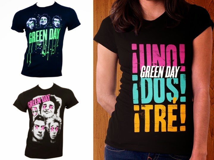 |
| The coordination of merchandise is clear to see on these Green Day tshirts, which share fonts, colours and images. |
 |
| Above are Green Day branded skate decks, converses and a poster. These follow the house style of the trilogy of albums and are targeted towards the target psychographic and demographic. |
Green Day Official Website Analysis
http://www.greenday.com

http://www.greenday.com
Also following the brand identity of the Uno, Doe and Tre album trilogy is the design of their official website, which follows the house style of the records. The pink and green of Uno, which is the most popular and heavily promoted album of the three, has been used consistently for fonts and banners, coordinating the albums and the website of the band that recorded it. The background, however, is blue so is in the same style as Tre; this means that multiple albums have been acknowledged so all are promoted. This cross media convergence will help sell the products, for people may be persuaded to buy Green Day's music after exploring who they are as a band; an interactive relationship between musicians and fans encourages people to carry on listening to the music, which is one of the reasons that as well as a website, the band has a twitter account. This means that social medai can taken advantage of in marketing the music digitally to the masses.
[Add video analysis here]
Institutions Research - Hopeless Records.
The Record label that I will pitch my media product to will be Hopeless Records. This particular institution is an independent record label; the decision to work with a record label of this structure has been taken into great consideration because of the large amounts of pros and cons that it brings. A multitude of reasons form the basis of this decision, with one being that the humble beginnings of the company lies parallel to those of the majority of pop punk bands, who often spend years working long, hard hours touring in run down venues, recording using limited equipment and extensively promoting themselves via social media and at local gigs. The similarities between the artist and the label, which due to plenty of hard work has grown after being founded 20 years ago with only $1,000, increase the understanding between the client and the business.
The company are known for working with little known bands to use their contacts, funds and marketing team to promote and assist them in the journey to success; one success story supporting this claim is that of the Baltimore pop punk band All Time Low, who were signed to the label whilst still unknown and have remained working alongside them throughout their career. The band have rocketed to success in a fairly short amount of time and are now famous worldwide, having been given he opportunity to tour with their idols in iconic bands such as Green Day and Blink 182; I hope for this success in the band within my music video and believe that Hopeless Records could offer this.
Other artists that the record label has worked with include popular bands of the pop punk genre, including:
- New Found Glory
- Taking Back Sunday
- Trophy Eyes
- The Wonder Years
- We Are The In Crowd
- Neck Deep
Analysis of ancillary product - Magazine advertisement for "Underclass Hero" by Sum 41.
ZqRWBNWo%2C2l(yw~~_35.JPG) |
| Above is a magazine advertisement for Sum 41's "Underclass Hero". |
Sum 41 are an established pop punk band with a large fanbase of both older and newer listeners and have played a large part in shaping the genre into what it is today. The album "Underclass Hero" has a title entirely fitting for the genre that it is because it connotes many of the messages that feature within the music and that the band promotes; these include rebellion and the abolition of elitism, highlighting problems in society. The title of the album will appeal to the target psychographic of listeners who will most likely be young adults and adolescents, many of whom do not fall into the "AB" category of income due to their age. A focus is put on the passion in the music, which is what is considered important over superficial topics that is focused on in much of today's mainstream music, therefore this album will stand out against its more popular competitors and appeal to lovers of pop punk, who do not mind this less superficial approach to music.
The font of the title has a handwritten appearance and is outlined in a hand drawn banner that holds the appearance of a simple "doodle". This will ensure that the band do not appear unapproachable, therefore standing by the values of a levelness between artists and fans within the pop punk industry that is demonstrated so often when musicians will meet attendees of their concerts free of charge, unlike many others that may charge a fee for the privilege. The scrawled handwriting and amateur appearance of the banner surrounding it is similar to that of drawings produced within the pages of so many school and college textbooks, making the product relatable to its demographic of adolescents that are most likely still in education and share the dislike for conformity that Sum 41 do in their song "Fatlip" that contains lyrics describing a lack of respect towards authority that can be transferred to one's views on the education system, encouraging rebellion in forms such as, for example, drawing instead of obeying one's tutor, thus rebelling and resisting authority. The white colour contrasts with its black background, causing it to be perfectly visible despite the fact that it is the least bold font of all that is included on this advertisement.
The title of the album is situated directly underneath the name of the band, which uses a vastly larger font. This font is also far bolder than the title, appearing thicker and more colourful in an eye catching shade of pink. The name of the band is also written in the top left hand corner which, according to the route of the eye, is the area in which the human eye is innately drawn to first. Reading this piece of information will trigger feelings of excitement for existing fans as well as recognition within most other people who will most likely have heard of them due to their considerable amount of fame and renowned reputation within the pop punk industry. New fans will therefore be attracted to the record because people may associate them with existing bands that make similar music, for example Blink 182, that they already enjoy listening to. It will also make people trust that the music will sound good because the band are well known, so must therefore be talented.For these reasons, the band's name has far more impact than the album's title. Also, the magazine advertisement was printed in music magazines that focus on similar types of rock music such as Kerrang! and Rocksound; this means that fans and those that have heard of the band will immediately recognise the name and become excited. The target psychographic and demographic of the target audience will be reached on a mass level due to the magazines being targeted towards fans of this music that they discuss and promote as well as their readership of thousands.
The fonts used for the name of the band is written in a distressed style, enforcing the themes of recklessness present throughout the band's music as well as that of the genre in general. It is written in sans serif along with the album title underneath which means it comes across as informal, meaning the album seems fun and, again, connotes a carefree attitude that is in most pop punk music. The font is very similar to that which is present across the promotional package for Green Day's trilogy of albums Uno, Dos and tres in style and colour, demonstrating how conventional it is and how effective it can be in selling products of this nature, for both f these records have sold well worldwide. The colours used in the house style of the magazine advertisement also almost match that of Uno by Green Day, with a vivid pink being used for various pieces of text to stand out against a black and white background image. The house style is present across many products and advertisements used to promote Sum 41's album, for example the same image and font is used on the album artwork of "Underclass Hero". This creates an instantly recognisable brand identity and makes use of synergy, increasing the album's ancillary revenue and overall profit margin, for the products work together in promoting each other. Again, the house style is conventional and is used by the similarly established pop punk band Green Day, and uses colours that compliment and contrast each other whilst conveying the themes of fun in the bright pink and attitude in the heavily dark areas of black and white. The black and white demonstrates how the band have matured slightly throughout the years, for they have grown up and discovered their style of music this will be apparent to existing fans, therefore will intrigue them so they will want to listen to the album and see if this change is for the better or if it decreases the quality of the sound produced by the musicians.
 |
| The album artwork for Sum 41's "Underclass Hero" follows an identical house style to that of the product's magazine advertisement and other ancillary products, reinventing the band's brand identity into one that is instantly recognisable and making use of synergy. |
A difference between the album cover and the magazine advertisement is, however, the inclusion of information surrounding its release date, where it will be sold, the band's official website address providing further information as well as details of a competition to encourage people to explore it, therefore be exposed to more marketing upon arrival on the site as well as encouraging them to listen to the album and therefore buy the record and continue to listen to it and future/past releases. This text takes up around half of the page so is easy to read and follows the house style of pink and white colours, tying in with the brand identity as well as appearing aesthetically pleasing because it will be complimented by all other aspects of the advertisement. This font differs from others included on the advertisement, however, because it is serif. Though a serif font is used, the piece still retains an informal appearance due to the impression that the text has been typed using a typewriter, suggesting unprofessionalism due to the old technology used. The fact that the artifact that would have been used to type this text had it not been written on a computer is can be perceived as, in a way, charming, encouraging positive feelings to be felt towards the album and its advertisement; this marketing is therefore emotive, thus effective in selling the product. The aged appearance of this text again reinforces the suggestion that the musicians have matured slightly with this record, meaning people may expect it to be an improvement on previous releases so will be encouraged to listen to it and buy it to see if this is the case. Typewriters and old yet well loved, as are Sum 41 by fans of pop punk music, thus supporting this impression even though it is not noticeable to viewers of the advertisement. This text is situated underneath the image and text depicting the band's name and album title because its purpose is to inform and direct to further marketing and information regarding the product rather than to attract attention, thus is seen last. Also, because it is read last, important details such as when and where to buy the product will stay in the reader's mind and further encourage them to purchase the album. At the very bottom right hand corner is the logo of the record label that the band is signed to, which is there for the record labels to subtly promote themselves by taking credit for some of the band's success b affiliating themselves with them. This is extremely small in size because it is of little interest to the reader.
The image used on the magazine advertisement is situated near the centre of the page with the subject of the shot, the band's vocalist, placed towards the right side of the page in a long shot that follows the rule of thirds. It would have been a well thought through decision to use the vocalist of the band as the main focus of the image used, for it is effective in a number of ways. The first is that due to the fame of Sum 41 and the frontman's outgoing, explosive personality, he is instantly recognisable so will attract fans, those who are curious about them and listeners of similar music to the advertisement immediately. It is conventional for band members, especially frontmen, to be the focus of images on album artwork and advertisements within pop punk and is again also used on Uno by Green Day.
The man is represented as being carefree as his body language is shown by the long shot to be slumped in from of the seemingly run down setting that features graffiti on the walls, representing the themes of destruction included in some of the band's music as well as in the alcoholism of the singer's past that may have been caused by this carefree, wild lifestyle that is typical of successful rockstars. A fire extinguisher is used as a prop, supporting these connotations made by the rest of the shot's mise-en-scene. The black clothing worn connotes that the man has matured along with his music whilst being a conventional colour within costumes of pop punk artists. This contrasts with the block of white colouring behind him, making the image stand out. The style and colours used for this image are considerably similar to those of Green Day's Uno, again demonstrating that this style is conventional and must be successful in representing the product accurately and appealingly because of the pop punk records sold relatively well across the globe. The fact that the man stand further to the right rather than in the centre means that the rule of thirds is followed, resulting in a more aesthetically pleasing visual.
Analysis of ancillary product - Digipak for 5 Seconds of Summer's self titled debut album.
No comments:
Post a Comment